 |
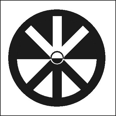
The image above was developed from the well-known peace symbol created by Gerald Holtom in 1958. I call this new creation the "Whole Peace Symbol".
Holtom's design was based on the semaphore signs for "N" and "D"—an abbreviation for "Nuclear Disarmament".
But his design was also meant to depict an individual with outstretched arms held down and the palms of the hands open—an expression of Holtom's despair at that time. Later, he asked that the symbol be inverted to represent a celebration of peace.
In any case, Holtom's peace symbol is a very attractive emblem. When I see it today, I have an immediate, automatic recognition and response. When I see his design, I think "Peace"—Peace with a capital "P".
However, his design looks bottom-weighted to me. And when inverted, it appears top-heavy. So I decided to try to give the symbol more balance. Now the image—the individual—is not only rooted down but also reaching up. Like a tree. The spiritual dimension of peace is, in this way, combined with the hard, onerous work of forging peace on this Earth.
I also decided that the black and white space needed to be balanced. So I have the top half reversing the bottom half, which I feel, increases the sense of wholeness.
This sense of wholeness, I hope, will create a sense of peace. When opposites are joined, when opposites become one, then the two forces are no longer in opposition.
By using the old symbol in the creation of the new symbol, perhaps the new will convey both the hard-won lessons of the past...
...and our vision—our aspirations—for the future.
|
|